

Choosing the right room colour designs when it comes to “what seems unique” is no longer the most effective. In 2026, humans will speculate more deeply about how colours will feel within their domain. After years of being surrounded by inspectors, on-site visitors, and a fast-paced urban existence, many homeowners now need rooms that feel calm, warm, and real.
That’s why this year’s colour trends are different.
Bright glossy walls are slowly disappearing. People are moving towards earthy shades, soft textures, natural tones, and colours that feel comfortable during everyday living. A room should not only look good in photos. It should also feel peaceful at 10 PM after a long day. Nobody wants to repaint their entire house every two years just because a social media trend changed.
Read Also: Small House Interior Design Ideas That Make Any Space Feel Bigger
So if you are planning a new home, renovation, or even one room makeover, these are the top trending room colour designs for 2026 that are becoming popular in Indian homes.
1. Warm Beige is Replacing Plain White
For years, white walls became the “safe option” in almost every flat and apartment.
But many Indian homes don’t actually look warm with pure white walls. In natural Indian lighting, bright white sometimes feels too sharp or hospital-like.
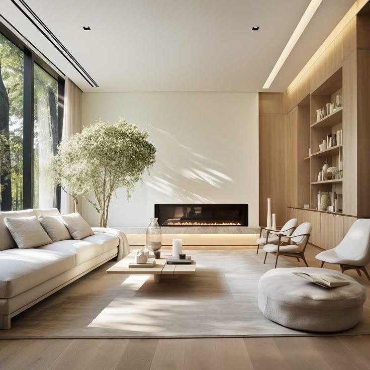
That’s why warm beige shades are becoming more popular in 2026.
These colours:
- Feel softer on the eyes
- Work well with wooden furniture
- Match Indian flooring styles
- Hide dust marks better than white
- Make rooms feel more comfortable
Especially in Gurgaon and Delhi apartments where sunlight changes throughout the day, warm beige creates a balanced look.
It also works well for:
- Living rooms
- Bedrooms
- Study areas
- Rental apartments
2. Earthy Green Shades Well Are Growing Fast
One colour trend that’s clearly becoming stronger is muted green.
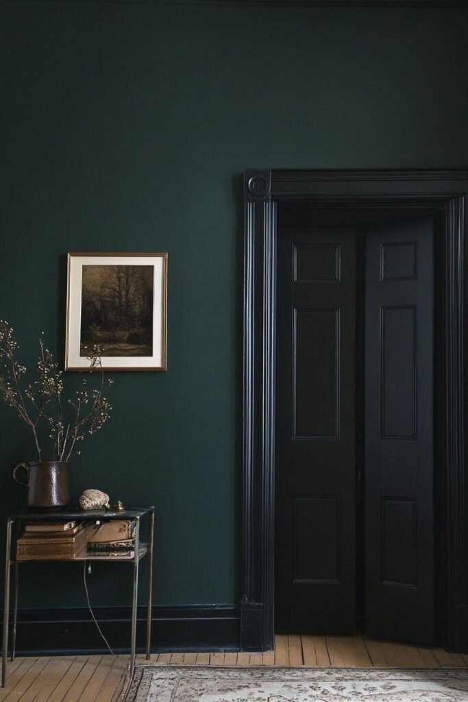
Not bright parrot green.
People now prefer:
- Olive green
- Sage green
- Dusty green
- Moss green
These shades connect well with indoor plants, wooden décor, and natural fabrics.
Many homeowners say green walls make the room feel less stressful.
And honestly, there’s some truth in that.
After seeing too much grey concrete outside every day, softer green tones bring freshness inside the home.
This trend is especially common in:
- Bedrooms
- Reading corners
- Home offices
- Balcony seating areas
3. Terracotta and Clay Colours Feel More “Indian”
One of the exciting things about the interior design trends of 2026 are the colors that humans are slowly experiencing the experiences associated with Indian homes of course.
Terracotta, clay, rust orange and clay-inspired sundresses are becoming popular again.
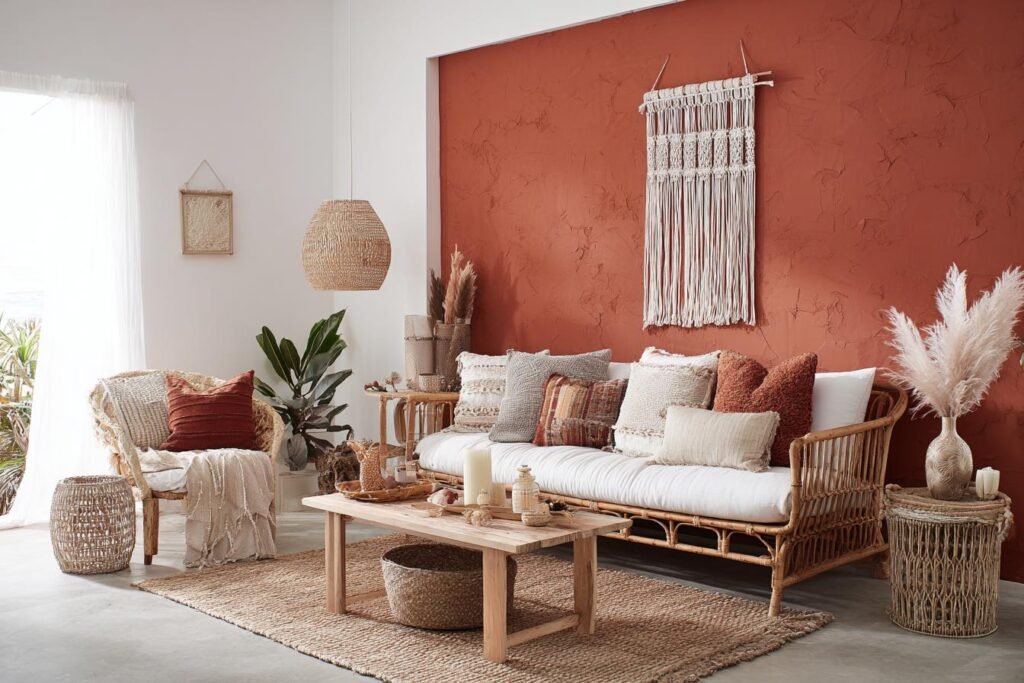
In the past, humans avoided these colors because they looked “old-fashioned.” But now designers are using them in modern ways.
These colours work beautifully with:
- Cane furniture
- Wooden textures
- Brass lighting
- Handmade décor
- Textured walls
The result feels warm, grounded, and personal.
Not copied from catalogues.
4. Soft Blue for Calm Bedrooms
Bedrooms are changing a lot.
Earlier, many people focused only on fancy furniture. Now they care more about sleep quality and comfort.
Soft blue shades are trending because they create a relaxed mood.
Popular shades include:
- Powder blue
- Smoky blue
- Grey-blue
- Muted sky blue
These colours work especially well in Indian summers because they visually feel cooler.
But one mistake people make is using very dark blue in small rooms. That can make spaces feel closed and heavy.
Lighter tones work better for most apartments in Gurgaon and Delhi.
5. Two-Tone Walls Are Replacing Fully Dark Rooms
A few years ago, dark accent walls became extremely common.
Now many homeowners feel they have become too repetitive.
In 2026, two-tone colour combinations are becoming more practical.
For example:
- Beige + olive
- Off-white + clay
- Grey + warm wood
- Cream + muted blue
This style adds depth without making rooms look too loud.
It also helps smaller flats look bigger and more balanced.
6. Matte Finishes Are Preferred Over Glossy Paint
This is a major shift happening quietly.
Glossy walls reflect too much light and show imperfections easily.
Matte finishes are becoming more popular because they:
- Look softer
- Feel premium naturally
- Hide wall unevenness better
- Create calmer interiors
Many experienced designers now prefer subtle elegance over shiny surfaces.
And honestly, matte walls also photograph better in natural lighting.
7. Ceiling Colours Are Finally Getting Attention
Earlier, ceilings were always painted plain white without much thought.
But in 2026, people are experimenting more with ceiling shades.
Soft cream, pale beige, or light pastel ceilings create a more complete look.
This works especially well in:
- Bedrooms
- Dining spaces
- Kids’ rooms
A slightly warm ceiling can make the entire room feel more finished.
Small detail. Big visual impact.
Why Colour Selection Feels Different in Gurgaon Homes
Homes in Gurgaon are changing fast.
Apartments are becoming more compact, while people are spending more time inside due to hybrid work lifestyles.
Because of this, colour now affects:
- Mood
- Lighting feel
- Space perception
- Mental comfort
This is why many homeowners now consult an interior design company in Gurgaon before finalising paint shades.
A colour may look beautiful on a small sample card but completely different inside an actual room.
Natural sunlight, room size, furniture colour, and flooring all change how paint appears.
That’s where experienced planning matters.
Common Mistakes People Make While Choosing Room Colours
Following Social Media Blindly
Many trendy rooms online look good only for photos.
Real homes need practical colours that feel comfortable daily.
Ignoring Natural Light
North-facing and south-facing rooms behave differently.
The same paint shade can look warm in one room and dull in another.
Using Too Many Colours Together
Too many bold shades create visual confusion.
Simple colour palettes usually age better.
Matching Everything Perfectly
A home should feel lived-in, not like a furniture showroom.
Small contrast actually makes interiors feel more natural.
Why Experience Matters in Interior Colour Planning
Paint selection sounds simple until walls are actually painted.
That’s when most people realise:
- The shade looks darker
- The room feels smaller
- Lighting changes everything
- Furniture no longer matches
This is where experienced planning helps.
Studios like XTORD Designs have worked on homes and commercial spaces since 2004, which gives a practical understanding of how colours behave in real Indian conditions – not just in catalogues.
That kind of experience matters more than trendy paint names.
Final Thoughts
The biggest bedroom color trend of 2026 is definitely pretty simple: comfort.
People need a peaceful, private and well-cleaned home to live in every day.
That’s why ceramic sunglasses, muted tones, warm neutrals, and soft herbal colors are extra popular than loud clothing design features
Good interiors show approximately not intensely priced paint.
They often create areas where humans undoubtedly feel relaxed.
And in fact, that feeling is not out of grace at all.
FAQs
1. What are the most trending room colors in 2026?
Warm beige, sage pristine, muted blue, terracotta, and earthy neutrals are among the most important room color trends for 2026.
2. Which shade makes a small room look bigger?
The lighter colors like cream, thermal white, beige, and gentle gray help small rooms feel more open and spacious.
3. Are dark wall colours still popular in 2026?
However, black colors are still used in balanced combinations against largely all-black classrooms.
4. Why do paint colours stand out when applied to walls?
Lighting, room length, daylight paths, furniture, and wall textures all affect how colors look in real-world spaces.
5. How do I choose the right interior color for my home?
Start instead of blindly following online trends with herb lighting, room purpose, furniture style, and luxury education.